Wrangling a blog with Astro Content Collections
How I set up a typed, validated blog pipeline in Astro: indexing, tags, categories, and the kind of schema errors that actually help instead of yell.
A branding job for a New Orleans THC seltzer started as one half-page print ad and quietly became the blueprint for the brand's entire landing page.
Most projects I take on have a clear shape going in: here’s the deliverable, here’s the deadline, ship it. This one didn’t stay in its lane. It started as a single half-page print ad and quietly turned into a full landing page redesign, built almost entirely from the assets the print job had already produced.
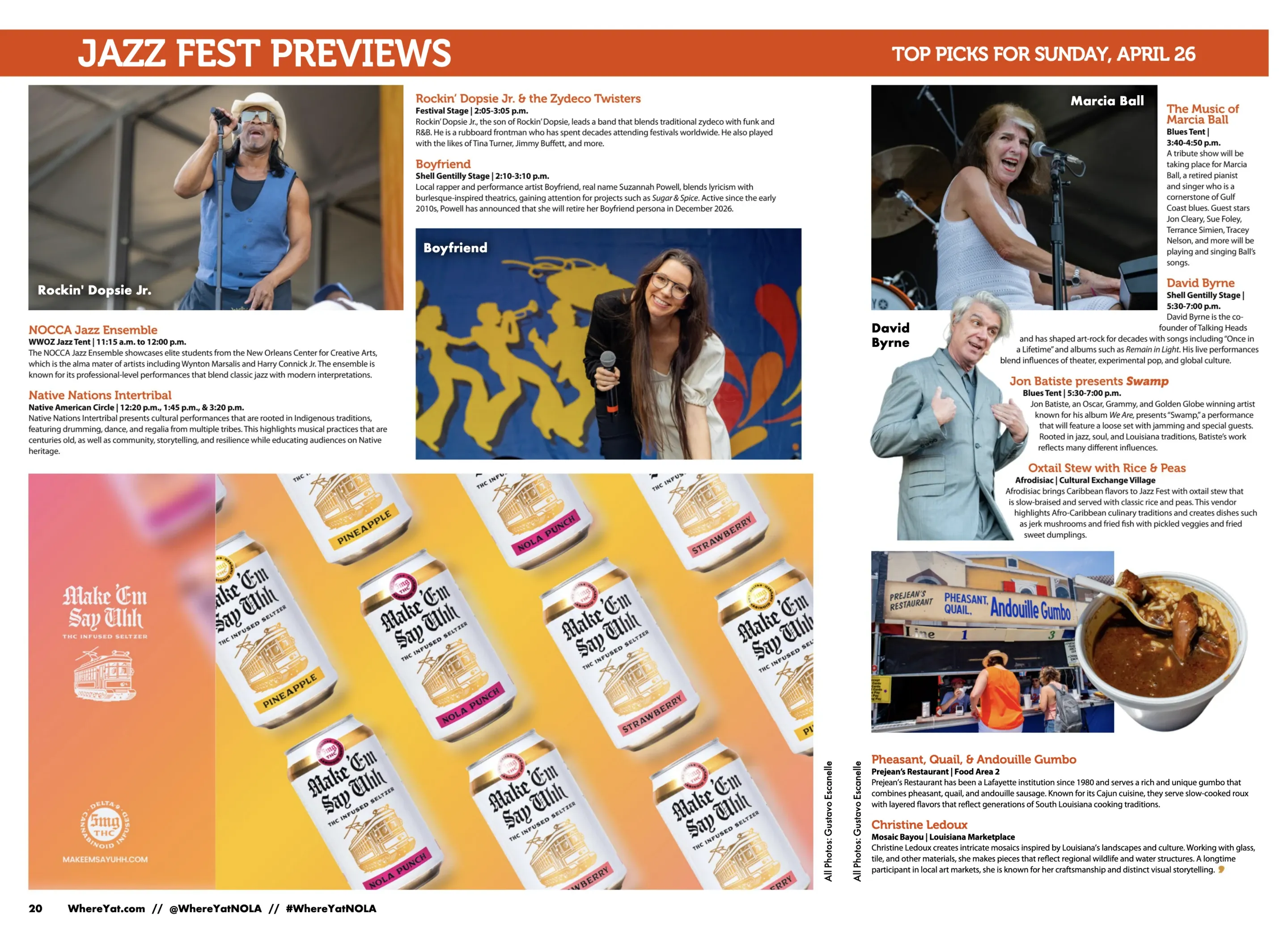
Make ‘Em Say Uhh is a New Orleans THC seltzer brand, and the brief was simple enough: establish a new visual presence built on high-saturation color blocking, with each color mapped to a flavor. Pineapple owns a warm yellow, NOLA Punch a hot magenta, Strawberry a coral pink. The first place all of that had to land was print.
Check it out for yourself: https://makeemsayuhh.com/
The deliverable was a half-page ad in the Jazz Fest preview edition of Where Y’at, a New Orleans culture magazine read by exactly the crowd this brand wants: people heading to a festival, looking for something to drink that isn’t another beer. A Jazz Fest issue is a good place to be seen and a bad place to be subtle. The page is surrounded by loud editorial, artist photos, food features, stage times, so a quiet ad just disappears.
Color blocking solved that before any layout existed. If each flavor owns a color, the brand reads as a system instead of a single can, and the page can be bright without being noisy. The constraint became the concept: let the product colors carry the weight, keep the typography to the brand’s blackletter logo and not much else.
I don’t like handing a client a single option, partly because the second concept usually clarifies what the first one was missing. So this went out as three.
Concept Top was the one I had built the color system for: a repeating, slightly chaotic pattern of floating cans over a flavor-coordinated gradient. It is busy on purpose. It reads as energy and abundance, and it scales, you can crop into any corner of it and still have a usable image.
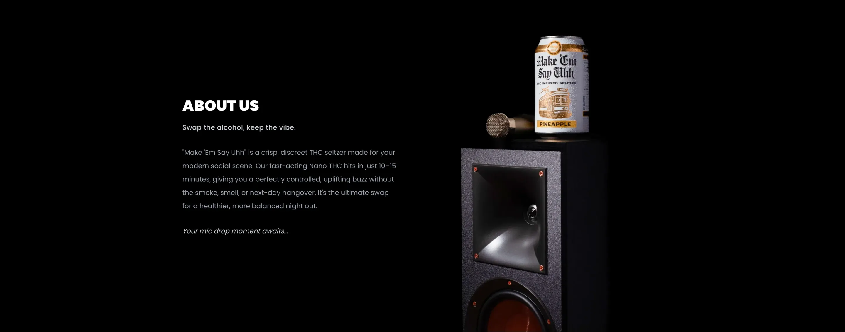
Concept Middle went the other way. Moody, low light, a single can sitting on top of an audio speaker cabinet, the kind of late-night premium look that says lounge more than festival. I liked it a lot. It was also wrong for a daytime Jazz Fest ad, which is the sort of thing that becomes obvious the second you set it next to Concept Top.
Concept Bottom leaned all the way into the festival itself: a high-energy concert crowd, cans front and center, big bold callouts. Closer to the right occasion than Middle, but it fought the magazine’s own photography instead of complementing it.
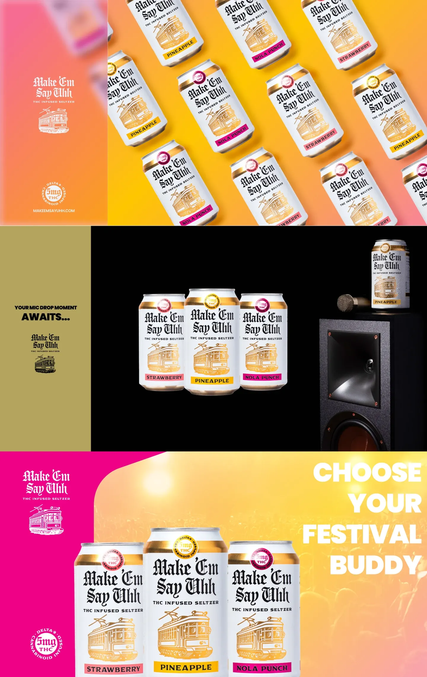
The client picked Top. It was the right call for the medium, and as it turned out, for a medium nobody had briefed yet.
Here is where the scope quietly doubled. The brief was one print ad. Once Concept Top was approved for the Where Y’at run, the client looked at it and asked the reasonable follow-up: can the website look like this too?
Their existing landing page was effectively a different brand. More text, more muted, none of the color system the ad had just established. So the new ask wasn’t a tweak, it was a full landing page rebuild to match the print direction top to bottom. The good news, which I didn’t fully appreciate until I started, was that I had already designed most of it. The print ad wasn’t only an ad. It was a style guide I had been paid to make under a different name.
Translating a static page into a scrolling one is mostly a question of what to keep and what to throw away.
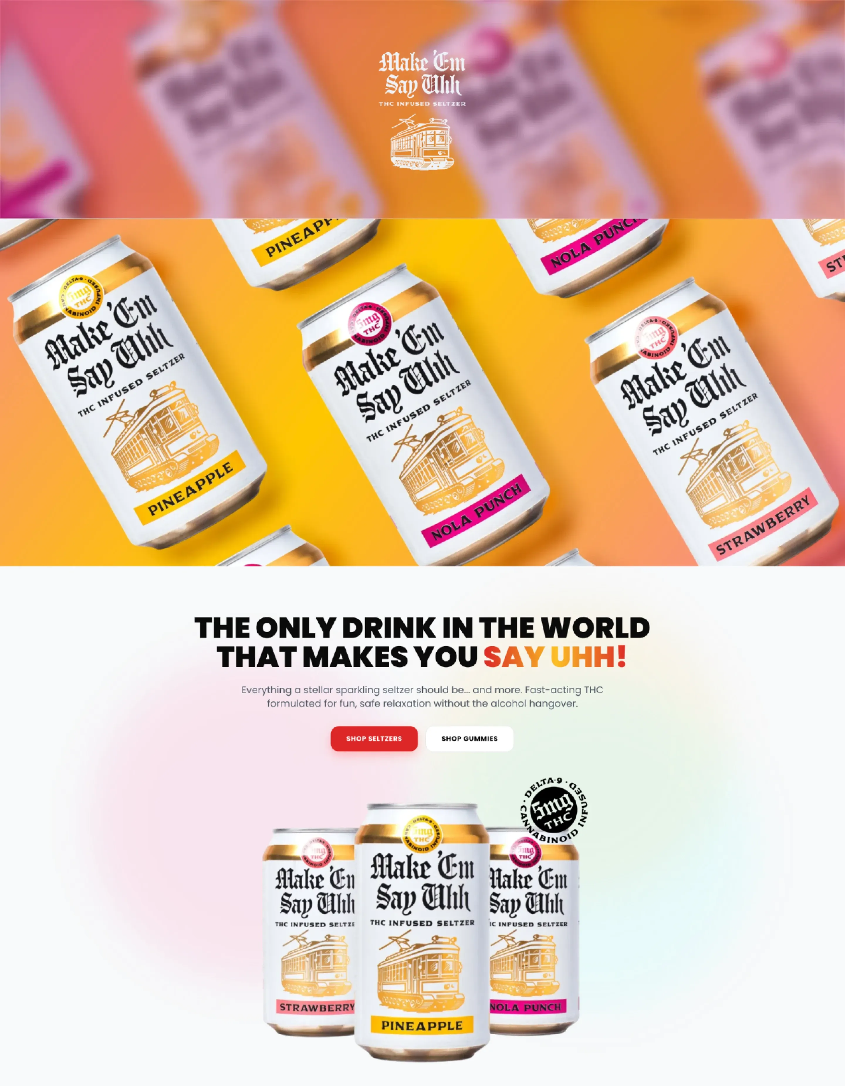
The hero section is the print ad, almost literally. The same floating-can gradient that ran in Where Y’at became the entry image, used as a minimal, high-impact background rather than a busy collage. The layout that once had to fit a magazine page now had room to breathe at the top of a screen.
Below it, the physical cans became clean digital product cards, floated and grouped by flavor so the color coding does the navigation work. You don’t need a label that reads “Pineapple” to find the pineapple, the yellow already told you.
The biggest change was subtraction. The legacy site leaned on heavy paragraphs of copy, and I cut most of it. When the imagery and the product colors carry the hierarchy, the words get in their way, so the new page says less and shows more. A few light UI animations handle the rest: enough motion to make the static print assets feel native to the web, not so much that the page turns into a fairground.
My favorite move was reusing the reject. Concept Middle, the dark speaker-cabinet shot that was wrong for a daytime festival ad, was exactly right as the About Us section at the bottom of the page. It became a high-contrast dark anchor that grounds all the bright color above it. The idea I had designed and shelved found its job two steps later, in a different medium, doing something I never planned for it.
The lesson I keep relearning is that good print work is rarely just print work.
A rigorous ad process forces you to settle the things a digital project also needs: the color system, the type treatment, the product photography, the visual hierarchy, even the rejected ideas you can repurpose later. By the time the Where Y’at ad shipped, the landing page was most of the way designed. I just hadn’t built it yet. The print deadline produced the blueprint for the digital one, for free.
None of that was the plan. The plan was one ad. But if you treat every asset as something that might get a second life, a single deliverable can quietly become the foundation for an entire ecosystem, and nothing you make has to go to waste. That is the part I am taking into the next project: design the ad like it is also the website, because one day it might be.